When French Provincial Meets Belgian Minimalism: The Joinery of Amara Homestead
There are projects that arrive with a clear brief, and then there are projects that arrive with a worldview.
Amara Homestead was the latter.

Our client, Dianne, is not someone who commissions a home and steps back. She builds with intent, documents the process with rigour, and brings to every decision a design intelligence shaped by years of living closely with architecture. Her previous home in Burradoo had already drawn significant attention: a refined, design-led property that established her as someone who understood the relationship between space, material, and lived experience at a level most clients simply don't. When she came to us for Amara, her second major build in the Southern Highlands, the brief wasn't a mood board. It was a conviction.
The building, designed by GUD Studio, set the frame. White rendered gable forms. A dark standing seam metal roof. White painted chimneys rising clean against the Southern Highlands sky. Steel-framed glazing (the Crittall grid recurring across every facade) giving the exterior its graphic tension between soft and hard, warm and industrial. Lombardy cypresses and mature olive trees anchoring the entry court. It is, in the truest sense, a home that references France without quoting it. The Normandy farmhouse typology reinterpreted through a completely contemporary lens.
Our role was to carry that language inside. And that is where the work became genuinely interesting.
The Interior Brief: Quiet, Tonal, Considered
What Dianne wanted for the interiors was something that resists easy categorisation. Not farmhouse. Not Hamptons. Not the kind of contemporary that announces itself. The closest reference point, if you know where to look, is the Belgian school of interiors: that lineage of warm minimalism associated with designers like Axel Vervoordt, where the palette is bone and putty and aged oak, where objects carry the room rather than the architecture, and where every material is chosen for how it will feel in ten years, not how it will photograph in ten days.
This sensibility shaped every joinery decision we made together.
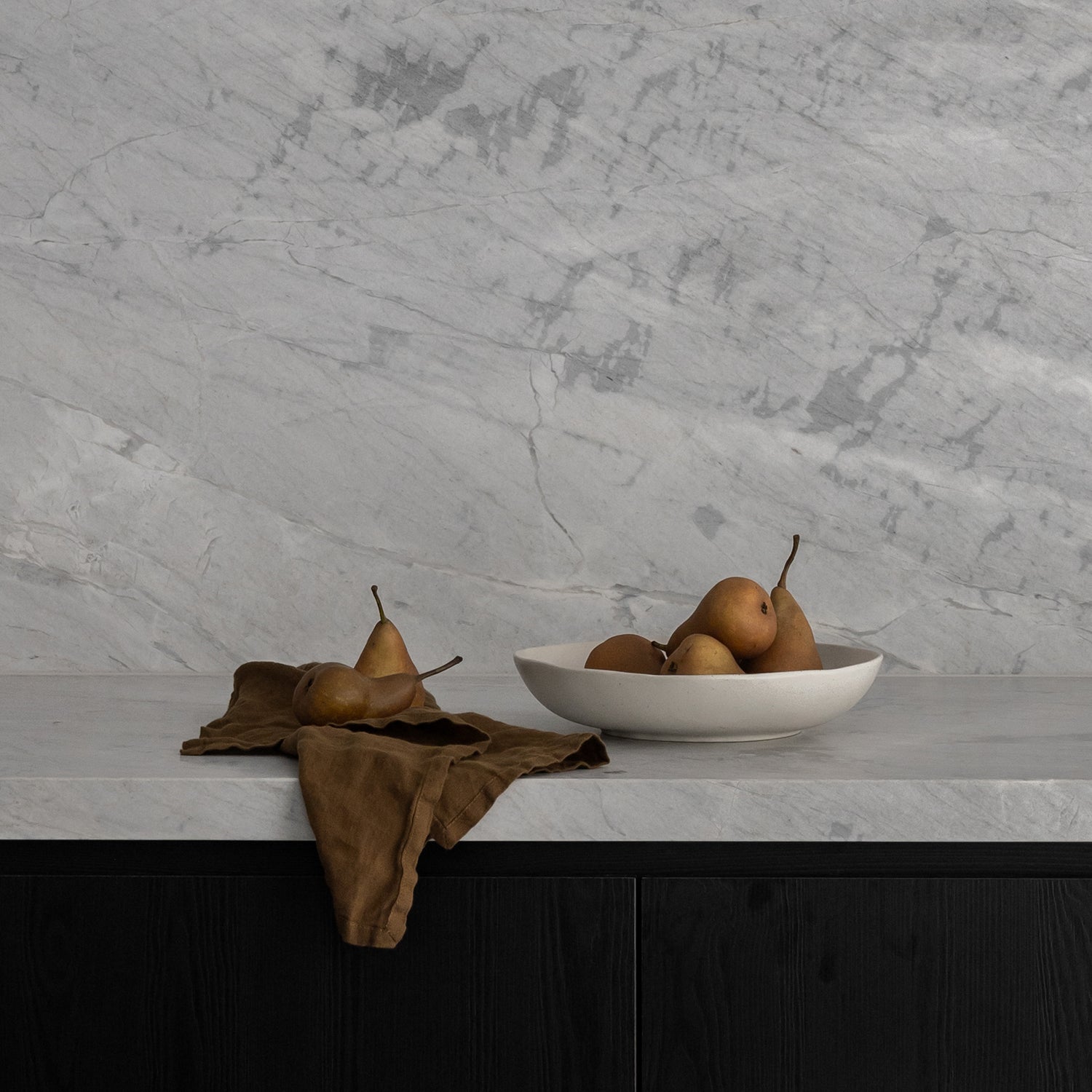
The palette across the whole home is deliberate in its restraint. Warm off-whites and greige tones carry the cabinetry. Raw European oak runs underfoot. Dark bronze hardware, a mix of D-bar pulls and mushroom knobs, provides the antique register that stops the interiors reading as new. Nothing is trying to be noticed. Everything is trying to belong.

The Kitchen: Where the Stone Does the Talking
The kitchen at Amara is built around a single design conviction: let the marble lead.
The stone, a deeply veined Arabescato with dramatic charcoal and burgundy movement, runs as both benchtop and full-height splashback, continuing behind the rangehood niche and returning as a shelf ledge that holds the room's curated objects. It is a stone that has genuine presence. Our job was to design cabinetry that gave it the stage without disappearing entirely.
The cabinetry is painted in a warm putty tone, close to the wall colour, intentionally so. Profile-free doors with minimal reveals. No decorative moulding, no raised panel, no period detail. The drama comes from the stone, not the joinery, and that was a conscious choice made together with Dianne. There are moments in a design conversation where a client says something that clarifies everything, and for this kitchen it was the understanding that the joinery needed to read as furniture: present, considered, but never competing.
The island is where the detail language speaks most clearly. A curved end softens what could have been a hard architectural form. The benchtop edge is a bullnose profile in the same Arabescato, a classical European reference, the kind of detail you find in a Parisian apartment that has been lived in for four generations. At the base, a reeded kick detail runs the length of the island, adding texture and craft at the floor line where the eye naturally settles. It is a small decision with an outsized effect on how the kitchen reads as a whole.
The hardware throughout, dark bronze, slightly irregular in its warmth, was selected to feel as though it had been sourced rather than specified. Antique, not aged. Considered, not decorative.
The Butler's Pantry: Designed to Be Used and Seen
The butler's pantry at Amara is not a hidden room. It is a continuation of the design language established in the kitchen, the same stone, the same palette, the same hardware, but with a brief that allowed for more openness, more display, more of the human texture that makes a home feel inhabited rather than staged.
Open shelving sits against the Arabescato splashback. Cabinet doors run floor to ceiling in the same putty tone as the kitchen. The shelves hold a collection of objects, silver pieces, ceramics, glassware, that Dianne has gathered over years. The joinery was designed to hold these things without framing them too tightly, to allow the room to feel curated rather than installed.
This is something we think about carefully at VICELLO. The difference between storage and display is often just proportion and restraint. A shelf that is slightly deeper than expected, a reveal that is slightly wider, a backing material that adds warmth rather than contrast: these are the decisions that determine whether a space feels designed or simply built.
The Collaboration: What It Means to Design With a Client
What made Amara possible, what elevated it from a well-specified project to something genuinely resolved, was the quality of the design conversation with Dianne throughout.
She arrived knowing what she didn't want as precisely as what she did. She had opinions about hardware at a level most clients don't reach. She understood material behaviour: how stone moves, how timber settles, how paint reads differently under the Southern Highlands' particular quality of light. GUD Studio had established the architectural framework, and within that, the three of us worked through the joinery decisions with the kind of rigour that only comes when a client is a genuine participant in the design process rather than an approver of options.
This is something we advocate for strongly. The best joinery outcomes we have ever produced have come from early, deep engagement, where the client's vision and our design thinking meet before the plans are locked and the site is moving. At Amara, that engagement was present from the beginning. The result is a home where the joinery and the architecture feel continuous, as though they were always going to be this way.
People will look at Amara and reach for a name. Contemporary farmhouse. French Provincial. Belgian minimalism. Organic modern. None of these are wrong, and none of them are complete.
What Amara represents, to me, is something more interesting than a style. It is the product of a client and a design team who were all fluent in the same design language and trusted each other enough to speak it fully. The European references are real and deliberate: the Crittall glazing, the rendered gable forms, the Arabescato stone, the bentwood Thonet chairs at the dining table, the bullnose island edge. But they are filtered through a Southern Highlands context, that particular quality of autumn light, the presence of established trees, the scale of the landscape, that makes the result entirely its own.
The joinery at Amara does not announce itself. It does not ask to be noticed. It holds the room, frames the stone, and creates the conditions in which a beautifully considered life can be lived.
That, ultimately, is what we are here to make.
Amara Homestead, Burradoo, Southern Highlands NSW. Joinery Design, Manufacture and Install: VICELLO Building Design: GUD Studio. Construction: Tasker Constructions. Photography: Dave Wheeler. Styling: Laura Rees.